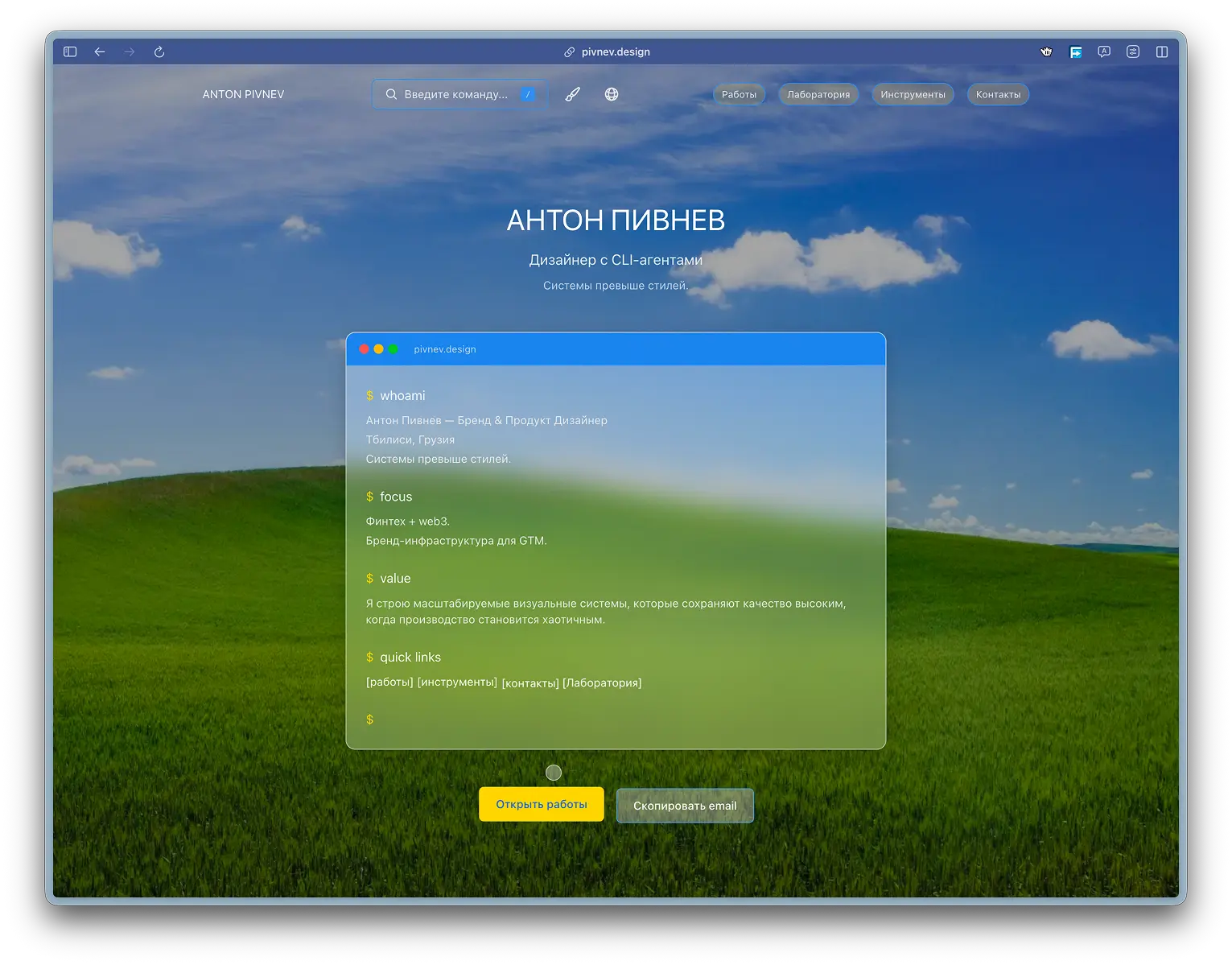
Interactive Functions and UX Features: cursor, magnets and interface tactility
How the project implements an interactive layer that makes the interface alive, but does not break readability, performance and accessibility.
Why complicate the cursor at all?
Portfolio sites usually go to one of two extremes:
- Completely static UX: “neat, but without character.”
- An overabundance of effects: beautiful on the first screen, difficult to use on the second.
In this project the task was in the middle. We needed an interface that:
- feels “physical” and responsive,
- gives feedback before clicking,
- does not interfere with basic navigation.
That is, the interactivity here is not a decorative add-on, but a functional orientation layer: the user reads with the cursor that there is text, an action, or a neutral zone in front of him.
What is included in this layer now
In the current state of the project, the interactive layer consists of three subsystems:
| Subsystem | File | Role |
|---|---|---|
| Custom Cursor | src/components/CustomCursor.tsx | Global cursor and its states |
| Magnetic Elements | src/components/CustomCursor.tsx | Attraction of interactive elements |
| Palette Cursor | src/components/CommandPalette.tsx | Cursor inside overlay palette |
Architecture idea: one “language” cursor behavior everywhere, but with a separate isolated rendering for the command palette.
Product principles on which this is collected
Before the code, simple rules were fixed:
- Zero surprises. The cursor should not “guess” something that is not obvious.
- Fast feedback. Transitions between states should be felt instantly.
- Gentle degradation. On touch and reduced motion the layer is completely disabled.
- Without manually registering each element. The system should pick up new DOM nodes itself.
- Performance is more important than decoration. If the effect interferes with the shots, the effect is simplified.
These principles are directly reflected in the code.
Layer 1: global custom cursor
Why is the system cursor hard hidden?
Instead of a “soft” CSS approach, we use style tag injection on the mount:
The reason is pragmatic: browsers have different edge-case states hover/focus, and local styles do not always give the same predictable result. Here we needed an “iron” baseline.
Conditions for inclusion
The cursor does not launch if:
- touch device,
- the user has
prefers-reduced-motionenabled.
This is not a “polite bonus”, but a mandatory requirement: a cursor is not needed on touch, and with reduced motion movement cannot be imposed.
Coordinate source and update rhythm
The mouse coordinates are written in ref and the visual position is updated in requestAnimationFrame.
Why so:
refeliminates unnecessary React rerenders,passive: truereduces the chance of blocking the main thread,requestAnimationFramesynchronizes the animation with the browser frame.
At one point the build broke: in Chromium the system cursor started leaking over the custom one again, and preview on port 3002 could load without the correct static assets. I removed heavy runtime fallbacks that were reapplying cursor styles on every pointermove and switched to one source of truth: mount-level lock plus a single cursor value url("/cursors/blank-32.png?v=4") 16 16, url("/cursors/blank-32.cur?v=4") 16 16, none. I also moved transparent cursor assets to public/cursors, synchronized the same value in globals.css, and fixed standalone preview by syncing .next/static and public into .next/standalone. This keeps Chrome/Arc stable: the native cursor no longer bleeds through and FPS stays smooth because there are no mass style writes in the hot path.
Layer 2: logic for selecting a target under the cursor
Candidate elements
Inside findHoverTargets() the elements are taken from the point x/y:
Next, each candidate is checked for interactivity using the selector:
And the text target is tracked separately if the interactivity is not found.
###Priority rule
For all targets, the distance to the center of the rectangle is calculated and the closest one is selected.
Plus, checking the activation threshold hoverThreshold = 5 prevents the cursor from “twitching” at borderline positions.
Separate text thread
When there is text under the cursor, the cursor becomes a vertical line (like a caret metaphor). This is done explicitly:
This detail seems small, but on long pages it helps: the user instantly understands that “there is readable content here” and not a button.

Interactive thread
For clickable elements, the cursor turns into an indented frame around the target.
Layer 3: micro-tactility when pressed
At mousedown the cursor shrinks (scale(0.9)), at mouseup it returns.
This is a short but important “action taken” signal.
Layer 4: magnetic effect
What exactly is happening
Each interactive node has a current and a target position. If the cursor enters the radius, the element is moved towards it within the limit.
Then the target position is smoothed:
Visually, this is perceived as a slight “elasticity” of the interface.

Why offset is limited
There is a hard limit so that elements do not “run away” and break the layout:
This is one of the most important limiters of stability.
Which elements become magnetic
The list of magnetic layer selectors is broader than just links and buttons:
This is done so that the interactive language is consistent throughout the entire project, and not just in the hero block.
Dynamic nodes: why is there MutationObserver
Without an observer, new elements (dropdown, palette, modal parts) would not be included in the magnetic map.
Result: the system maintains integrity even with a dynamic DOM.
Contract data-hover-target
In a project, many components specifically mark elements with the data-hover-target attribute:
- buttons in the header,
- menu items,
- interactive links,
- CTA buttons,
- elements of the terminal block.
This is important because the cursor receives not only “semantic” tags (a, button), but also explicit author interaction zones.
Example:
This is how the developer directly tells the system: this element must have an interactive response.
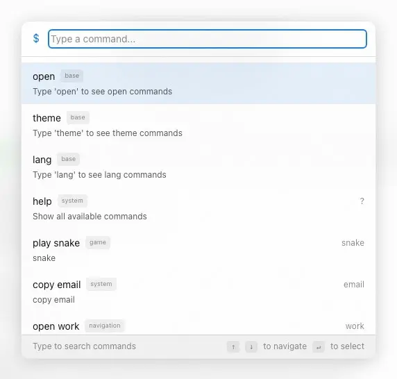
Separate cursor inside Command Palette
Why couldn't you just reuse the global
The palette is rendered through the portal in #overlay-root and lives in another layer on top of the page. CommandPaletteCursor was created for it, almost repeating the logic of the main cursor.
Reasons:
- separate z-index stack,
- separate goal rules (
data-palette-cursor-target), - a separate behavior model inside the overlay.
This gives stability: the cursor in the palette does not conflict with the background cursor.
How the palette area is limited
Within CommandPaletteCursor only elements marked data-palette-cursor-target are taken into account:
Thus, the cursor does not “grab” elements under the overlay and does not get confused in the layers.
Visual parameters that shape the feeling
| Parameter | Meaning |
|---|---|
| Base cursor size | 20x20 |
| Text mode | 1x28 |
| Padding interactive frame | 8px |
| Hover threshold | 5px |
| Magnet radius | 150px |
| Max. magnet bias | 10px |
| Ease cursor/magnet | 0.15 |
This table is useful as a “tuning map”: by changing any parameter, you can immediately expect a specific UX effect.
Performance: what keeps the system fast
1) Animation outside of React-state
Moving coordinates are stored in ref rather than useState, so every pixel does not cause the component to be rerendered.
2) requestAnimationFrame
Both the cursor and the magnet are updated in requestAnimationFrame, making the animation synchronous with the browser frame.
3) translate3d
Offsets are applied as translate3d(...), which usually fits better on the GPU composition.
4) will-change
In utilities.css, interactive elements are pre-labeled:
5) Moderate transition
Transition speeds vary by mode (text, interactive, none), which reduces visual jitter in difficult areas.
Availability: where are the boundaries of the effect?
Reduced motionIf the user requests minimal movement, the overlay cursor is not rendered.
###Touch
On touch devices, the interactive layer is completely disabled, leaving the native platform model.
###Focus
System focus styles remain in CSS (:focus-visible), so keyboard navigation is not lost.
The idea is simple: interactivity should not break the basic mechanics of accessibility.
Link to the rest of the site
This layer does not work in isolation. It is related to:
StickyHeader(buttons, dropdown, palette trigger),TerminalTranscript(interactive bracket links),- cards of projects and lab materials,
- CTA buttons on the main and internal pages.
Therefore, the cursor system actually becomes a single “kinetic language” of the interface.
What can go wrong (and how to catch it)
1) The cursor remained system on some elements
Check:
- style tag injection into
CustomCursor, - presence of conflicting
cursor:in third-party styles, - focal states
input/button.
2) The magnet does not work on new nodes
Check:
- selector in
magneticSelector, - activity
MutationObserver, - whether the layer is disabled due to touch/reduced motion.
3) The cursor “twitches” at the edge of the buttons
Check:
hoverThreshold,- correctness
targetRect, - presence of fractional transformations in parents.
4) In the palette, the cursor touches the background
Check:
data-palette-cursor-target,- z-index for
#cursor-portaland overlay, - correctness
closest('[data-palette-cursor-target]').
Mini manual test checklist
- On desktop, the cursor is hidden wherever it is expected.
- On the text, the cursor turns into a vertical line.
- On buttons and links, the cursor circles the element.
- When clicking, a slight compression is noticeable.
- The magnet is felt, but does not distort the layout.
- In the Command Palette, the cursor behaves just as consistently.
- On touch the effect is disabled.
- With
prefers-reduced-motionthe effect is disabled.
Replication: where everything is
If you need to repeat the approach in another project, just move:
- cursor component,
- contract
data-hover-target, - CSS tokens (
--cursor-bg,--cursor-border, easing variables), - gating by touch/reduced motion.
Why this approach worked
Key reason: the layer is assembled as an interaction framework rather than a set of effects.
- There are clear rules for enabling and disabling.
- There is a deterministic choice of goal.
- There are restrictions on amplitude and speed.
- There is isolation of overlay scenarios.
Therefore, the interface feels alive not only on the first screen, but throughout the entire length of the product.
What can be expanded further
- Add adaptive
hoverThresholdto fit the element. - Enter different magnet profiles for
.btn,.tag, cards. - Add dev mode with visualization of radius and targets.
- Move the cursor logic into a separate hook for reuse.
- Add telemetry based on the time of interactions (without tracking personal data).
These steps are no longer necessary for the current version, but are useful if the system grows.
Conclusion
Interactive Functions and UX Features in this project is not a “wow layer”, but a working UX mechanic:
- the cursor explains the context,
- magnet adds tactility,
- the palette retains a single interactivity in the overlay,
- accessibility gates prevent effects from harming the user.
It is in this form that interactivity becomes part of the product, and not just a visual trick.
Appendix A: fine-tuning parameters
Below is a practical table of how changing each parameter affects the feel of the interface.| Parameter | Current | If you increase | If you reduce |
|---|---|---|---|
| hoverThreshold | 5 | Fewer false outputs, but possible stickiness | faster release, but risk of jitter |
| padding interactive | 8 | the frame is “softer” and more noticeable | looks more accurate, but less “tactile” |
| magnetRadius | 150 | the effect is felt from afar | the effect appears only nearby |
| maxDistance | 10 | “pull” is stronger, but there is a risk of displacement layout | more delicate, but less expressive |
| ease | 0.15 | catches up with the target faster, more “sharply” | smoother, but may appear viscous |
This is useful when you need to adapt an interactive experience to a different visual style.
Appendix B: How a layer is embedded in different types of components
Buttons and CTAs
For buttons (.btn), the magnet and cursor outline act as a direct confirmation of “you can click here.”
Tags and filters
For .tag the effect adds a micro-feedback, but should not interfere with text reading. Therefore, the restrictions on maxDistance are critical.
Cards
Balance is important for .card: too strong a magnet turns the card into “jelly”, too weak - it does not give a sense of interactivity.
Text zones
Linear cursor mode (1x28) works as a visual reading marker and helps not to confuse text with a button.
Appendix C: Fault Map and Quick Fixes
| Symptom | Probable Cause | Quick fix |
|---|---|---|
| The system cursor is sometimes visible | style conflict / mount effect failed | check injection of style and lifecycle component |
| Cursor does not circle buttons | data-hover-target is missing and the selector does not match | add attribute or expand interactiveSelectors |
| Magnets are not available everywhere | elements were added after initial mount | check MutationObserver |
| Lags when moving | too many target elements + heavy background | reduce selector area, check will-change |
| The cursor in the palette touches the background | contract broken data-palette-cursor-target | check overlay and cursor portal markup |
Appendix D: Practical Protocol for Implementing a New Project
- Connect basic cursor variables (
--cursor-bg,--cursor-border). - Add a global cursor component to the layout.
- Enter the contract
data-hover-targetinto the component design system. - Connect the magnetic loop and
MutationObserver. - Add touch/reduced-motion gating.
- Check overlay scenarios with the portal.
- Run a manual checklist on desktop and touch.
Appendix E: what is especially important not to lose during refactoring
1) Separation of “motion logic” and “render logic”
If you mix goal calculations with React-state updates, the cursor will quickly start to lag.
2) Explicit exclusions of system layers
Ignoring .custom-cursor, .grain-overlay, .lightbox-overlay, #overlay-root is mandatory, otherwise false targets will appear.
3) Limiting magnet displacement
The offset limit protects the layout from visual destruction.
4) Degradation at the level of architecture, not patches
Disabling touch/reduced-motion should occur before the cursor is rendered, and not “after” through CSS crutches.
Appendix F: Quality Criteria for this Subsystem
To consider an interactive layer “ready”, all of the following conditions must be met:
- There is no double cursor on any page.
- The target type is read visually without clicking.
- The magnet is felt, but does not break the layout.
- The palette and the main interface behave uniformly.
- Predictable degradation works on touch/reduced-motion.
- Changes in the DOM do not “break” the system after 1-2 clicks.
If at least one point is not fulfilled, the layer cannot yet be considered stable.
Final output for the interactive layer
The main value of this system is not in its effectiveness, but in its controlled responsiveness:- the user constantly receives context confirmation,
- the interface feels seamless in all sections,
- and the development team can support the system without chaotic crutches.
That is why the cursor and micro-interactions are placed in a separate infrastructure here, and not left as a set of local animations.