Interactive Gaming System: Interactive gaming system
Interactive mini-games as a “reward for attention” in the portfolio
Why are there games here at all?
On my previous sites, I saw the same effect: a person came “to look at the portfolio for 2 minutes,” and then suddenly froze - poking hover effects, trying interactions, climbing through hidden things. At some point, I realized that this was the right metric: not “how many seconds on the page,” but “whether the site was remembered as an experience.”
Therefore, games here are not “let’s prove that I can do game development,” and not “here’s a challenge for you to set a record.” These are Easter eggs that work as a reward for attentiveness and curiosity: if you dig deeper, the site responds not with another form of communication, but with a little entertainment.
Plus, this is a direct bow to Vova Lifanov and his studio Suprematika: on his website there were (and perhaps still are) “tic-tac-toe”. For me, this is one of the best examples of how a “simple thing” becomes part of the identity and atmosphere.
How does a user find games?
Games don't lie on the surface. This is intentional.
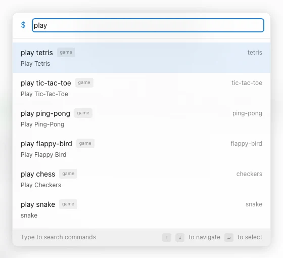
Access is available through the Command Palette (command menu), but the list of games appears only after the command play. That is, the scenario is like this:
- Open the command menu
- Enter
play - You get a list of games and launch any
play is the “key” to the Easter egg. In UX terms: a reward layer that appears only if the user has paid attention.
Inspiration and visual style
Visually, the system stands on two legs:
- Site Theme Most of the UI picks up the current theme (light/dark, etc.), uses common tokens, and feels like part of one product rather than a “built-in widget.”
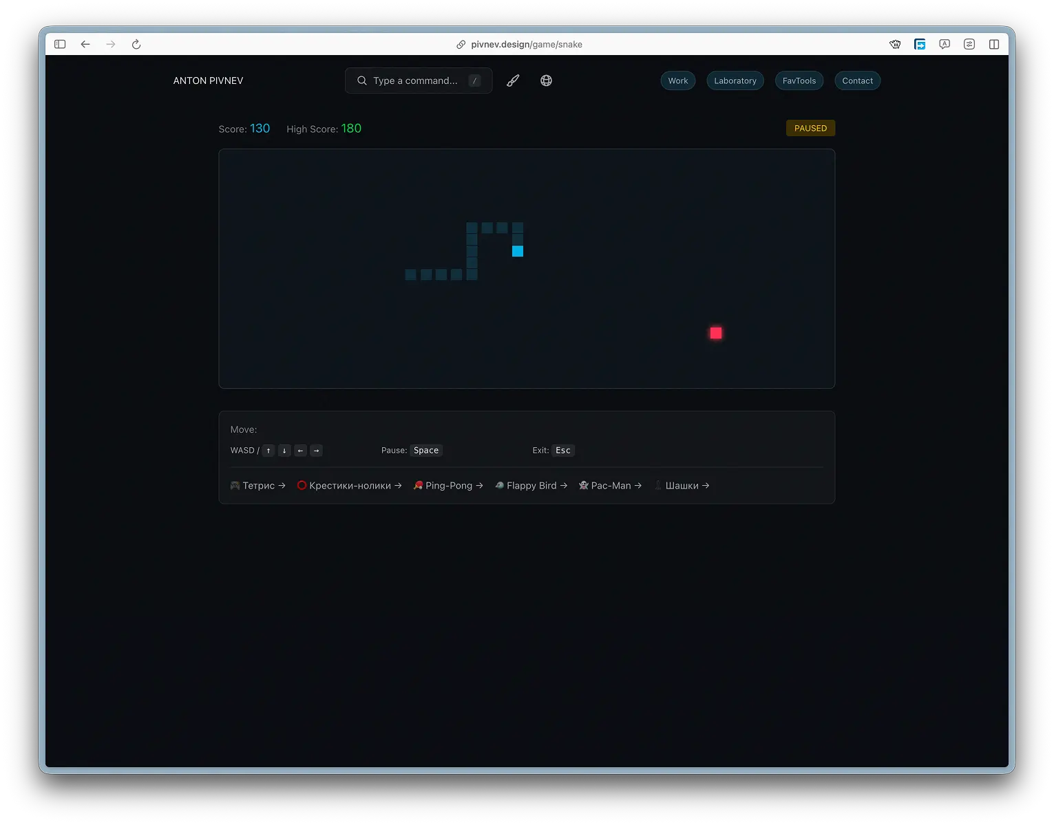
- GitHub aesthetics. The most striking example is Snake: it visually refers to the contribution grid (mesh, cellularity, “digital field”). This is a deliberate reference: those who are in the know instantly read the vibe.
List of games and how they work| Game | File | Technology | Render | Saving | Why is she here |
|------|------|-----------|--------|------------|-----------------|
| 🐍 Snake | /game/snake/page.tsx | Grid + React | div-grid | High Score (localStorage) | "GitHub vibe", quick stick |
| 🎮 Tetris | /game/tetris/page.tsx | Grid + React | div-grid | High Score (localStorage) | meditation + familiar classics |
| ⭕ Tic-Tac-Toe | /game/tic-tac-toe/page.tsx | Grid + React | div-grid | session | direct bow to Suprematika |
| 🐦 Flappy Bird | /game/flappy-bird/page.tsx | Canvas | game loop | High Score (localStorage) | "Zen balance", tuning sensations |
| 🏓 Ping-Pong | /game/ping-pong/page.tsx | Canvas | game loop | session | pure motor skills, mouse instead of keys |
| ♟️ Checkers | /game/checkers/page.tsx | Grid + React | div-grid | session | more complex logic, but simple presentation |
🐍 Snake
Snake here is not about “reaching the speed of light.” This is a short, understandable cycle: you control the direction, collect food, grow, and carefully avoid hitting the wall. It should work as a "clear your head" tab, not as an arena for high scores.
What is important in UX
- Controls should be instantly clear: arrows/WASD.
- Pause/exit - no surprises.
- Visual - “gitHub grid”, so that it feels like part of the site, and not a separate game.
Technically
The field is 40x20, the speed starts at 120ms/turn and accelerates to 60ms. High score is saved in localStorage.
Game loop (movement + collisions + food)
Food generation (without spawning in the snake's body)
####Save/load record
Render mesh ("what's in the cage" logic)
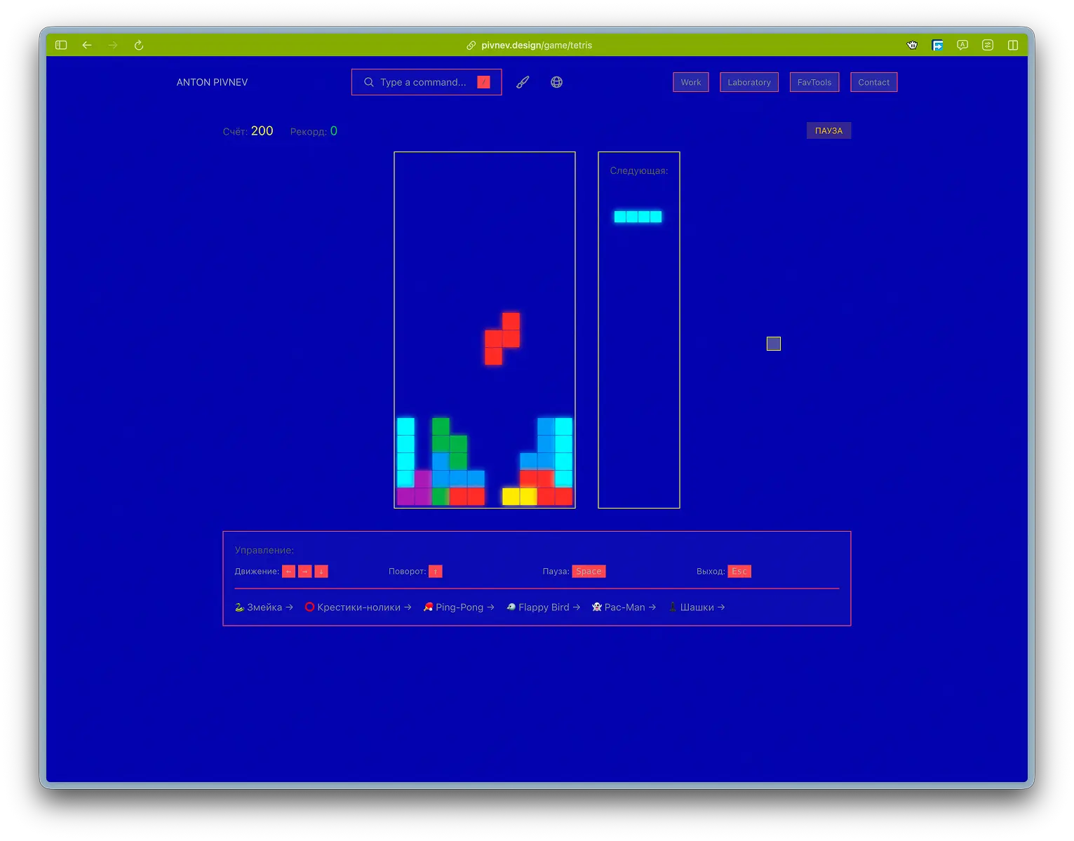
🎮 Tetris (Tetris)
Tetris is an ideal “diagnosis of fatigue”: if your brain is overheated, you begin to make mistakes in basic actions. This is how I use Tetris myself: not high scores, but “switch mode.”
What is important in UX
- No “competitive pressure”: it just plays smoothly and clearly.
- Preview of the next figure - so that the brain doesn’t go crazy.
- Pause/exit - quick.
Technically
Field 10x20. Speed drops from 800ms to 100ms. 7 types of tetrominoes.
Description of figures
Checking collisions (boundaries + occupied cells)
Rotate the figure (without the wall-kicks complication)
Clearing lines + scoring
⭕ Tic-Tac-Toe (Tic-Tac-Toe)
This is the same easter egg based on Suprematika: the simplest game possible, understandable to everyone. There are no ambitions here to “make the perfect AI.” The idea is to give a short pause and smile.
What is important in UX
- AI thinks with a delay (otherwise it feels like a “script” and not a game).
- You cannot click while the computer is moving.
- Statistics should not turn into a “tournament”.
Technically
Winner verification
Computer progress (simple logic + delay)
Block clicks during AI turn
🐦 Flappy Bird
Flappy Bird is about the right balance: a little tension, but without the feeling of “physics is killing me.” I actually caught a situation where the test settings made the game unplayable (the bird fell like a stone), and I had to bring it to a state of “zen, but not completely free.”
What is important in UX
- The controls should be stupidly simple: space/arrow.
- Collisions should feel fair.
- The gameplay should have a 30-90 second “air” period.
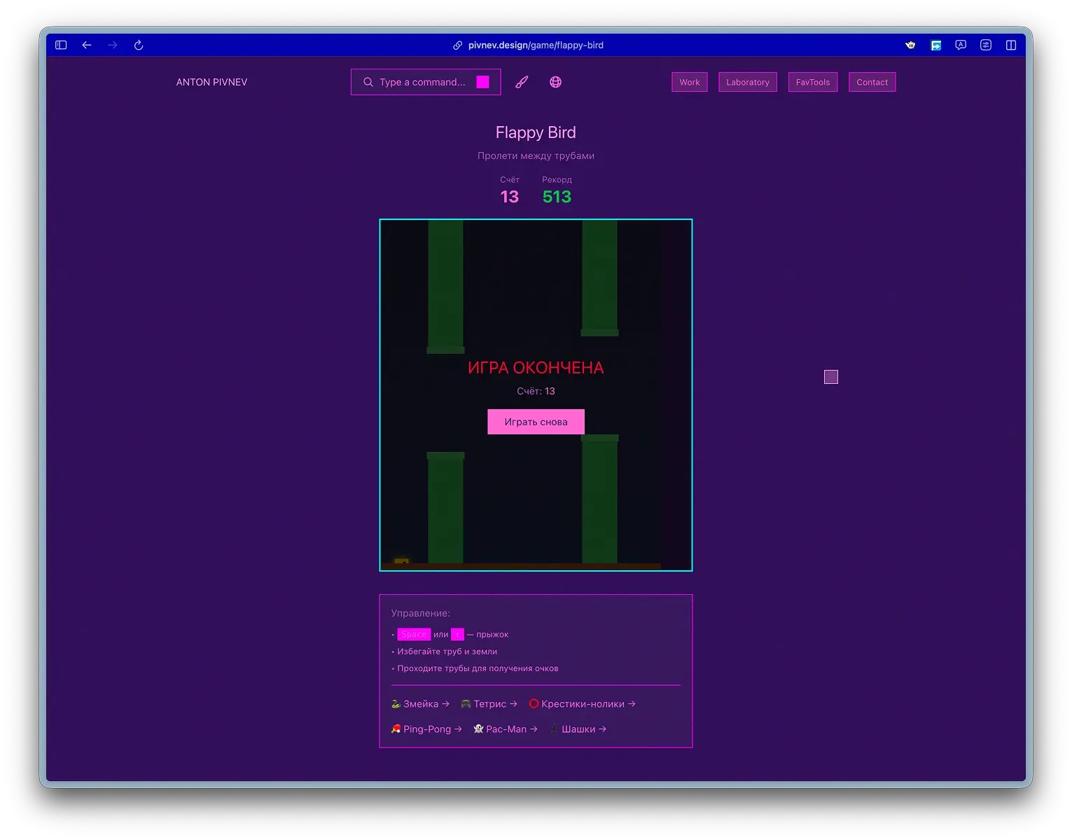
Technically
Canvas 400×500, bird 20×20, gravity 0.2, jump -4, pipes: width 50, gap 140, distance 220.
Update cycle (physics + pipe generation)
Collisions + scoring + record
Draw (background + pipes + bird)
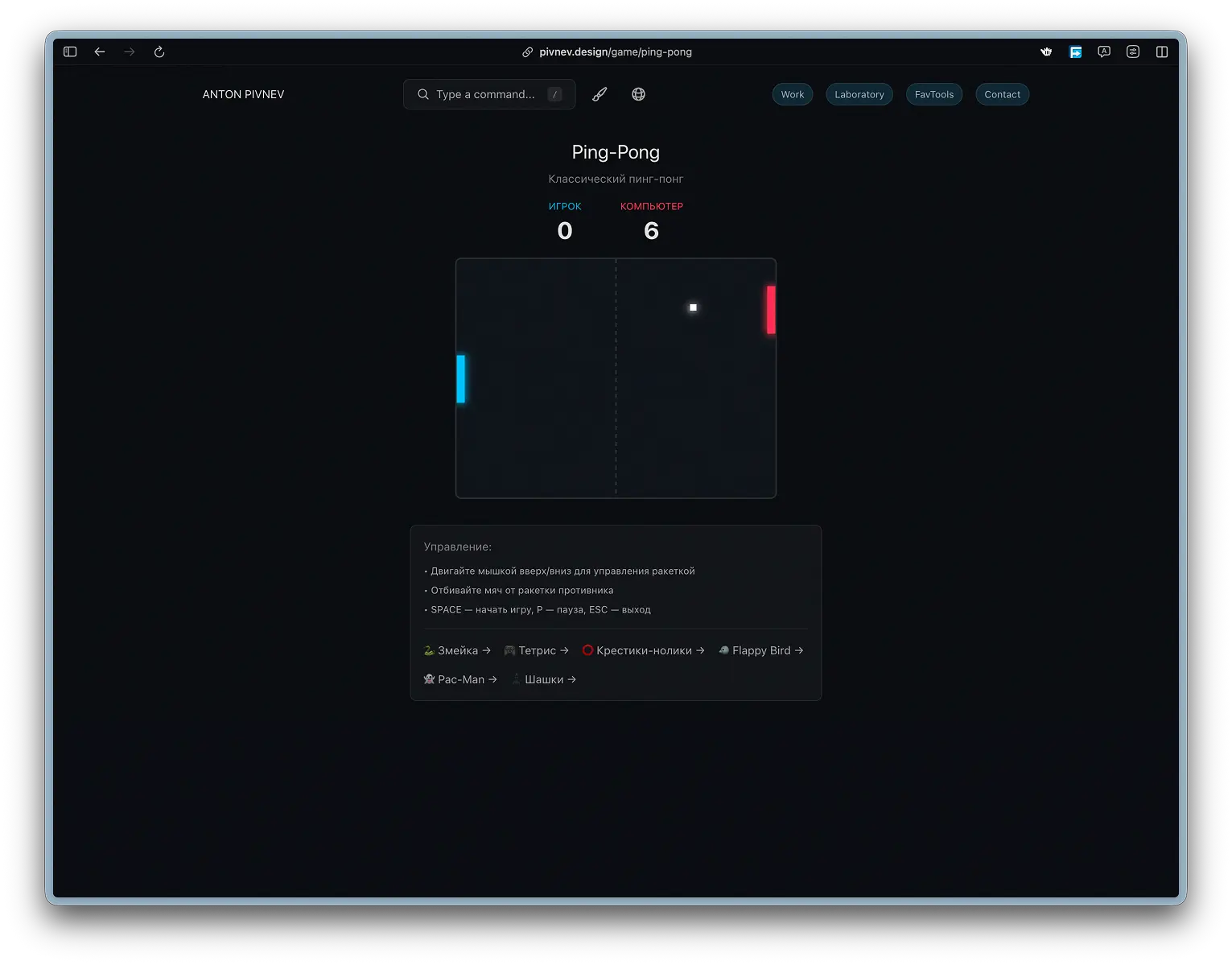
🏓 Ping-Pong (Ping-Pong)
Here was the most practical UX solution: at first I made controls with up/down arrows, but it turned out to be stupidly slow and inconvenient. Ping-pong is about “motor skills + reaction”, so the control is transferred to the mouse: it feels natural and fast.
What is important in UX
- Mouse control should be direct and sticky.
- AI doesn't have to be perfect: otherwise it quickly turns into an annoyance.
- The game should last as long as you need, without pressure.
Technically
Canvas 400x300, racket 10x60, ball 8x8, acceleration of the ball after impact 1.05x, AI travels at a speed of 4x0.85.
Bounce physics (player + AI)
AI (simple ball tracking)
Mouse control (binding to canvas)
♟️ Checkers
Checkers is the most “logical” game in the set. There is less “quick sticking” here, more “think calmly for 10 seconds.” At the same time, I deliberately did not create a “chess engine”: the AI is simple, but the UI and rules are understandable.
What is important in UX- Highlighting available moves (otherwise the beginner will drown).
- Mandatory acquisitions must work correctly - otherwise there will be immediate mistrust.
- Moves should be predictable and “fair” to the eye.
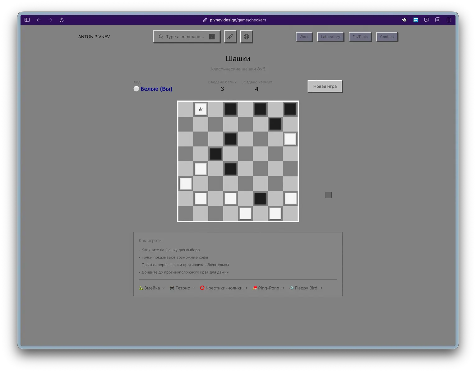
Technically
Board 8x8, 12 white + 12 black. Player - white below. AI runs with a delay of 500ms and priority to capture.
Initializing the board
Transformation into a queen
AI: collection of all moves + priority of captures + random selection
📊 Game comparison
| Game | Technology | Render | AI | Saving | Feeling |
|---|---|---|---|---|---|
| Snake | Grid | React | — | High Score (LS) | quick stick |
| Tetris | Grid | React | — | High Score (LS) | meditation/rhythm |
| Tic-Tac-Toe | Grid | React | Random | session | easter egg/smile |
| Flappy Bird | Canvas | JS | — | High Score (LS) | balance/zen |
| Ping-Pong | Canvas | JS | Tracking | session | motor skills/reaction |
| Checkers | Grid | React | simple | session | think calmly |
Reproducibility
The point of the article is that this can be repeated: manually or through a CLI agent. There is no “magic” here: games are ordinary pages built into the site, and a general set of patterns.

Structure
Each game is a separate page in the src/app/game/… folder:
General state model
Almost everywhere there is the same “skeleton”:
status: playing | paused | gameover- control handlers (keyboard/mouse)
- update cycle (via interval or requestAnimationFrame - in canvas games)
- separate logic "reset/restart"
- saving the record in localStorage where appropriate
Record saving pattern
This is the same technique: compare score with highScore, write down the key, load it at startup.
Quick check of localStorage
A set of general principles- Games are only available through play in the Command Palette - this is an Easter egg, not a section of the site.
- The complexity is deliberately moderate: this is a portfolio and a platform for experimentation, and not a portal for record holders.
- Pause/exit should be clear and quick (Esc, P/Space - depending on the game).
- Where it makes sense, only the high score is saved, not the “progress”, so as not to turn the site into a “game account”.
- The visual language is tied to the theme of the site and the overall feel of the interface.
- If the control can be made simpler, it should be simpler (example: Ping-Pong with a mouse instead of keys).
Conclusion
To simplify it to one thesis: these games do not exist in order to “play on the site,” but so that the site is perceived as an experience that you want to touch with your hands. In a portfolio, everything is usually predictable: projects, cases, contacts. There is a second layer here - a small reward for curiosity, which opens only if you actually interact with the interface and reach play.
Technically, this is not a “mini-game portal”, but a neat set of pages assembled on clear patterns: a simple state machine (playing / paused / gameover), predictable controls, and minimal progress saving (high scores where appropriate). I deliberately did not make the games hardcore: they should work like a “switch” button - for a minute or two - and at the same time be lively enough for a person to remember the very fact that one can get stuck on a portfolio.
If you want to replicate this for yourself, the key is not to copy Snake or Tetris. The key is in the architecture of the approach: Easter eggs through the team, uniform UX rules, a common visual system, and fair restrictions (simple complexity, minimal storage, clear output). In this format, games become not “content”, but part of the language of the site - and this is what makes the entire experiment reproducible.