Terminal UX and General Atmosphere: Command Palette, Transcript and interface rhythm
A detailed analysis of how the terminal UX layer is assembled in the project: from calling commands to the atmosphere of glass, noise, fonts and transitions.
Why the terminal approach is appropriate here
The project is built around the idea of “systems over styles”. Therefore, the navigation language must also be systemic:
- not just buttons,
- not only the menu,
- but a single command surface.
Command Palette in such a scenario solves several problems at once:
- Shortens the path to action.
- Gives quick access to the configuration (theme/lang).
- Adds a recognizable product character.
- Naturally connects “work” and “game” mode (via
play ...).
This is important: the terminal here is not a metaphor for the sake of aesthetics, but a way to manage the site faster.
The whole picture: what blocks does it consist of?
| Block | File | What does |
|---|---|---|
| Sticky Header | src/components/StickyHeader.tsx | Palette trigger (/), quick theme/language controls |
| Command Palette | src/components/CommandPalette.tsx | Commands, search, ranking, keyboard |
| Overlay Root | src/app/layout.tsx + src/app/globals.css | Insulated layer for portals |
| Terminal Transcript | src/components/TerminalTranscript.tsx | Animated “dialogue” on the main page |
| Visual Utilities | src/styles/utilities.css | Glass, blur, grain, interactive styles |
| Theme Variables | src/styles/variables.css | Variable themes, background images, contrast |
If any of these blocks are removed, the “terminal” sensation disintegrates.
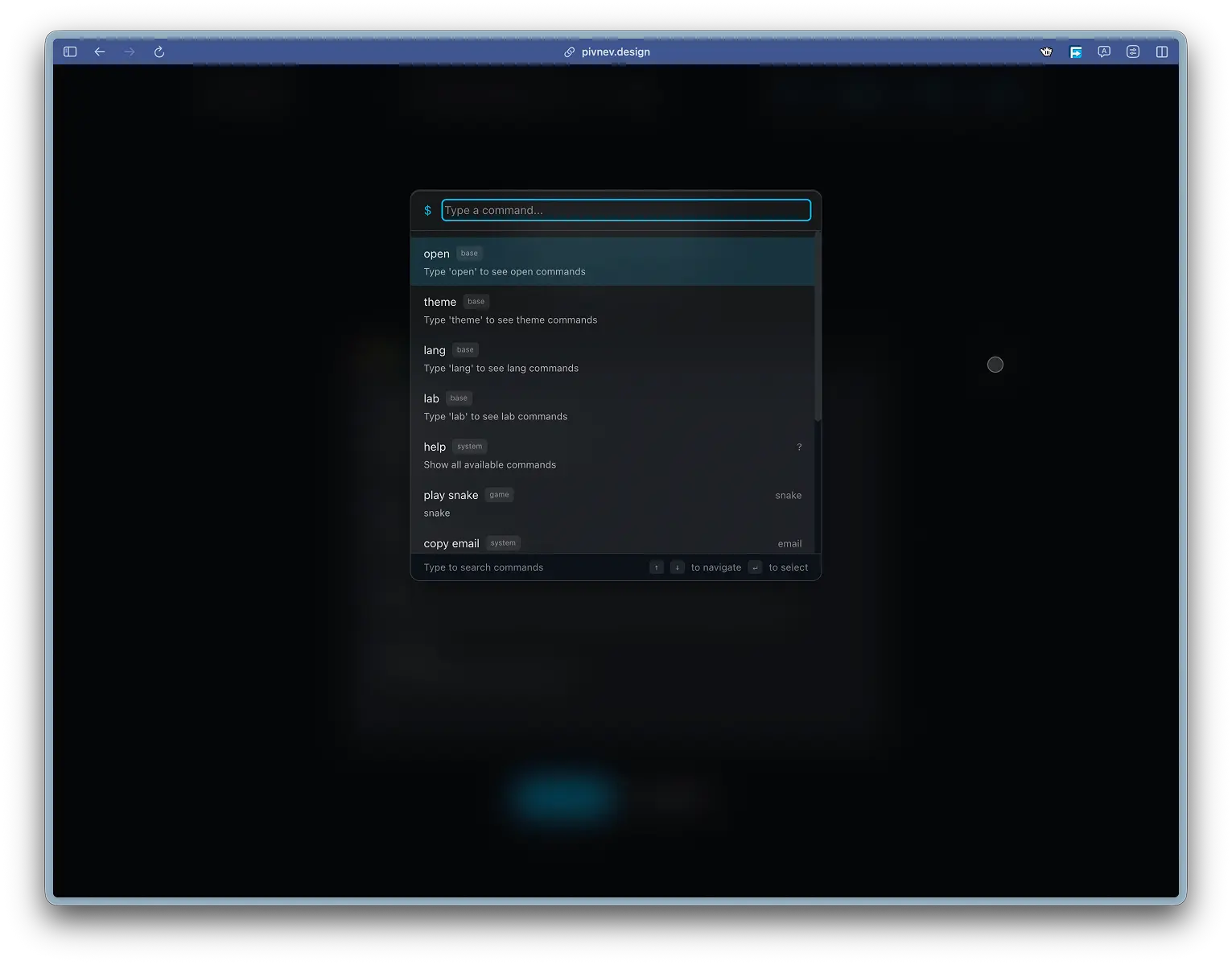
1) Entry point: / key
Opening the palette is implemented at the StickyHeader level and works globally, except for input/textarea.
This is a familiar pattern from devtools/IDE products: the command should be called instantly, without a mouse.
2) Command Palette as a command model
Command Interface
There is a type Command in the palette:
That is, each command is not a string, but an object with behavior and metadata.
Basic command domains
Current configuration includes:- open ... - transitions by sections and projects,
theme ...- switching one of 13 themes,lang ...- select any supported language,play ...- launch games,copy email,help.
This mixture is important: the palette becomes not a “page search”, but an operating console of the interface.
Generating commands from data
Some commands are assembled dynamically:
- themes: from
THEMES(ThemeProvider), - languages: from
allLanguages, - projects: from
projects.json.
This reduces the risk of desynchronization between the UI and the actual system capabilities.
3) Command hierarchy and “basic” nodes
The palette uses basic node commands:
If the user enters only theme or lang, the subcommands for the corresponding domain are shown. This makes the interface closer to the CLI approach, where there is a namespace + action.
4) Contextuality according to the current route
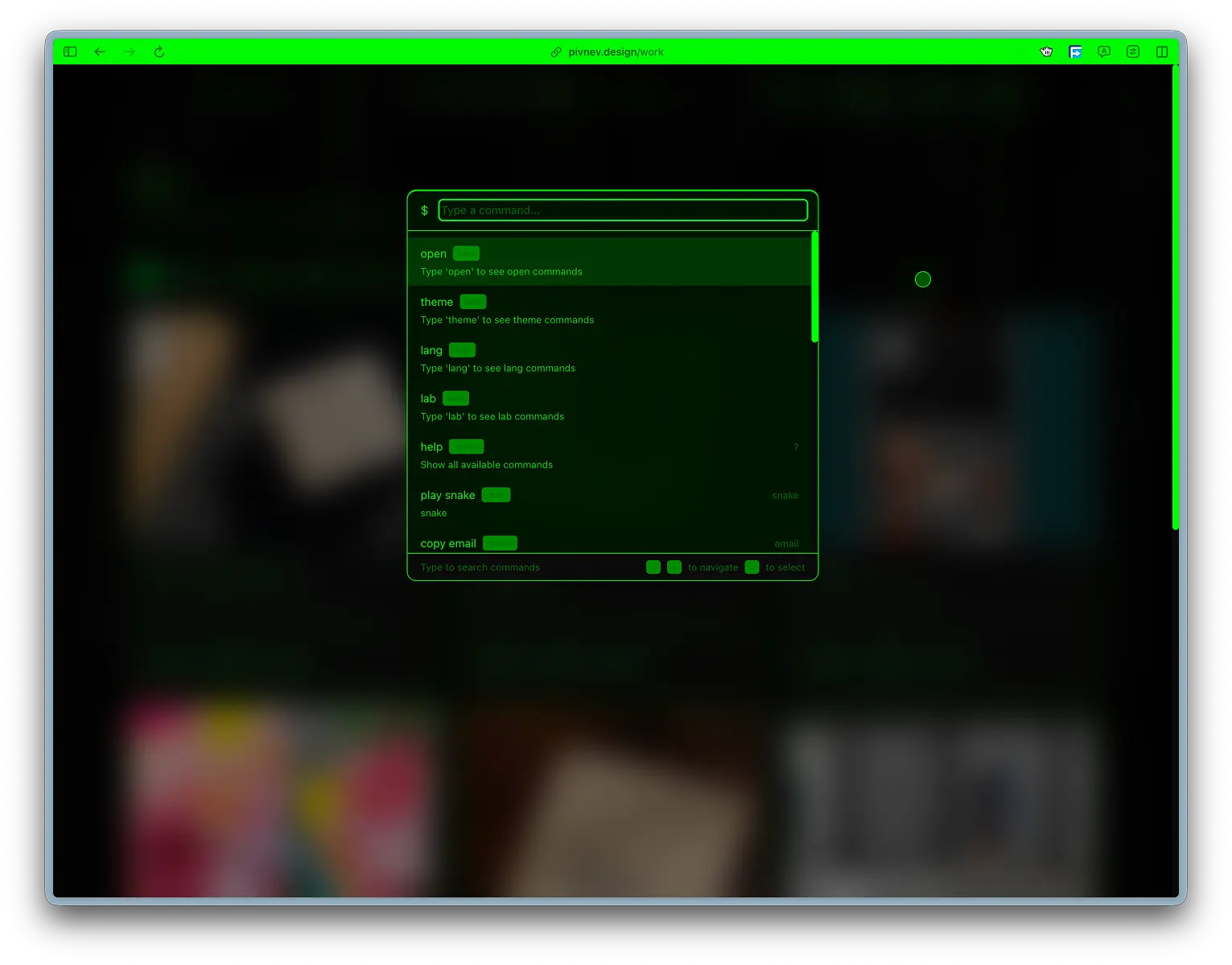
One of the key UX layers is getContextualCommands().
Principle:
- if the user is on the main page - priority of transitions to sections,
- if on the game page there are quick transitions to other games,
- if in work/favtools/contact - a set of relevant navigation actions.
This reduces noise and makes the output "locally useful" rather than just a long generic list.
5) Search in the palette: scoring, not includes
Why simple filtering is not suitable
If you search only cmd.name.includes(query), the user regularly gets irrelevant order of results, especially on short inputs.
How it was decided
There is a separate function searchCommand() with a scoring model:
- exact name match:
+1000, - the name begins with the request:
+500, - alias exact match:
+800, - alias prefix (with length restrictions):
+400/+100, - match in description:
+10, - additional boost for navigation.
As a result, the behavior of the palette becomes noticeably more predictable.
Exact match when Enter
Before executing the selected element, the palette tries to find an exact match based on the entered string:
This protects against a situation where the user has typed the exact command and another element is selected.
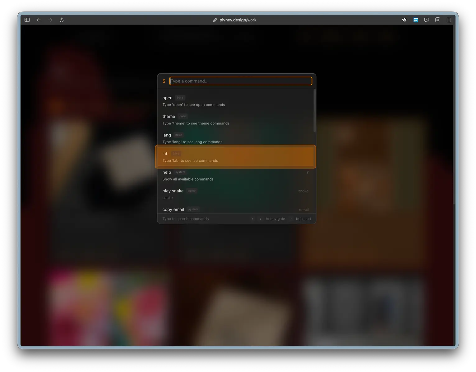
6) Keyboard UX: full cycle without mouse
Standard set supported:
ArrowUp / ArrowDown- choice,Enter- start,Tab- autocompletion,Escape- closing and resetting the mode.
Additionally, there is an auto-scroll of the list to the active item:
This makes a long list of commands manageable without losing context.
7) Palette as overlay: portal and isolation
The rendering goes through createPortal to #overlay-root.
Why is this needed:
- Independence from the layout tree of the current page.
- Predictable z-index.
- No conflicts with
transform/filterparent containers.
In globals.css for #overlay-root protective styles (transform: none, filter: none, will-change: auto) are specified separately.
8) Separate cursor in the palette
Inside the palette, CommandPaletteCursor is rendered, which repeats the CustomCursor model, but works in a separate area and with its own targets (data-palette-cursor-target).
This ensures a consistent cursor language throughout the entire application, including the overlay layer.
9) Visual atmosphere of the palette
The palette uses a glass container:
glass,glass-palette,glass-noise.
Basic styles:
Plus a separate darkened backdrop for the overlay:
This layer is needed not only for beauty, but also for readability with a complex background of the theme.
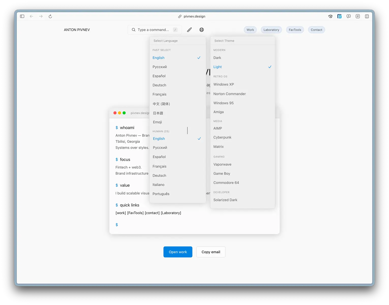
10) Terminal Transcript on the main page
Idea
TerminalTranscript is a welcome block that showcases the project as a “system interface” rather than a static landing page.
Command blocks:
whoami,focus,value,quick links.
The content is taken from translations via t(...), which means the transcript is automatically localized along with the site.
Print Animation
First the blocks are shown with a delay, then the lines are printed character by character.
Speeds:
15msper symbol,100mspause between lines.
This gives the feeling of a “live session”, but without dragging on.
Interactive quick links
Transcript lines contain bracket references ([work], [contact], [timeline] and localized variants). On click they route the user.
This links the seemingly "decorative" block to the actual navigation.
11) Hat and glass “physics”StickyHeader builds a multi-layer glass effect when scrolling:
- Distortion layer (
feTurbulence+feDisplacementMap). - Separate clean border.
- Top highlight gradient.
- Very light noise.
This is a rare case where the visual layer works as part of the UX:
- the header maintains readability on any topic,
- when scrolling, the “floating panel” context appears,
- the user does not lose navigation controls.
12) Atmosphere outside the palette: grain, glass, typography
Grain overlay
A global grain-overlay is added to the layout, which creates the “materiality” of the background, but with low opacity.
Text and interactive utility styles
.interactive, .tag, .btn, .card give a single rhythm of hover/active states.
Font link
In layout.tsx, fonts for themes are included (JetBrains Mono, Orbitron, Share Tech Mono, Inconsolata), and the specific choice is made through the CSS variable --theme-font.
Bottom line: the atmosphere changes with the theme, but the structure of the interface remains recognizable.
13) Theme and language as commands, and not just as UI controls
The project has two equal personalization channels:
- buttons/dropdowns in header,
- commands
theme ...andlang ...in the palette.
This is an important UX idea: the user can operate with a mouse or keyboard without losing full functionality.
State is maintained across providers in localStorage, so choices are preserved between sessions.
14) Performance and stability
What has been done
- event
scrollwith{ passive: true }in the header, mousemovewith{ passive: true }in the cursor,- overlay portal separate from the main tree,
- text transcript without heavy libraries,
- CSS utility layers on theme tokens.
Why is this important?
Terminal UX quickly becomes heavy if you add a lot of blur, fixed layers and animations. Here the effects are distributed across layers so that the load is predictable.
15) Accepted compromises1. The palette looks very “rich” visually, but this requires careful control of the z-index and overlay structure.
- The list of localized quick links in the transcript is maintained manually, which increases the scope of support.
- Some commands are left with historical names (for example, some game aliases) so as not to break the usual inputs.
These are conscious decisions in favor of a stable user experience.
16) Mini-guide to reproducing the approach
If you transfer the circuit to another project, the minimum set is as follows:
StickyHeaderwith a palette hotkey.CommandPaletteas an object model of commands.- Scoring search instead of
includes. - Portal rendering to a separate root.
- Command access to interface settings (theme/lang).
- Transcript block with live printing and interactive links.
- Unified system of visual tokens for glass/noise/contrast.
17) Practical testing checklist
/opens the palette everywhere except the input fields.Esccloses the palette and clears the search state.ArrowUp/Down/Enter/Tabwork without a mouse.- Exact match runs the desired command even if the selected index is different.
- The commands
theme ...andlang ...actually change the state. - The
open ...and project commands lead to the correct routes. - Transcript links are clickable and route correctly.
- Overlay remains on top of content on all pages.
18) What can be improved next?
- Place the command metadata table in a separate registry file.
- Add fuzzy highlighting of matching symbols directly in the search results.
- Autogenerate part of transcript-link dictionaries from i18n data.
- Add telemetry by command frequency (locally, without personal data).
- Divide the dispensing modes into “quick” and “advanced”.
These improvements are not required for the current version, but will help scale the layer.
Conclusion
Terminal UX and General Atmosphere in this project is a complete system, where:
- the palette provides a quick path to action,
- transcript sets the tone and immediately guides the user along the routes,
- the visual atmosphere supports the character of the interface,
- personalization is built right into the command layer,
- all this works in a single architecture of portals, tokens and providers.This is how the terminal style turns from aesthetics into the working mechanism of the product.
Appendix A: Real User Flows through the Palette
Below are typical scenarios for which command-first UX is generally needed.
Stream 1: “came to look at the work”
- Press
/. - Enter
open work.
3.Enter.
- Next
openinside the work section.
Stream 2: “I want to see a site in a different topic”
/.- Enter
theme. - Select one of the subcommands (
theme matrix,theme c64, etc.). - Instantly apply the theme without rebooting.
Thread 3: “check localization”
/.lang.- Language selection (
lang ja,lang ar,lang emoji,lang js). - Saving state in
localStorage.
These flows form the real value of the terminal layer.
Appendix B: help mode and its role
The help command in the palette does more than just show tooltip text. It switches the list to "all commands" and turns the palette into a reference book.
This is useful in two situations:
- first visit when the user does not know the syntax,
- return to the project after a while, when the commands are partially forgotten.
Architecturally, this is a separate showHelp-mode, not a separate documentation page.
Appendix C: how the bridge between content and atmosphere works
The terminal UX does not live separately from the rest of the interface. There are direct connections:
- The theme changes visual tokens and redraws the glass/transcript/palette.
- The language changes the transcript text and command descriptions.
- Header and Palette use a single set of interactive patterns.
- The Cursor system is uniform in the main layer and in the overlay.
This is important for consistency: the user changes the environment, but does not lose the “behavior” of the interface.
Appendix D: practical analysis of ranking using examples
Request: wo
Most likely open work will be higher because:
- the name prefix matches,
- command in the navigation category,
- a short request does not give alias skew.
Request: matrix
Usually the higher one will be theme matrix:
- matching topic alias/id,
- the command precisely corresponds to the search intent.
Request: snake
As expected, play snake works:
- direct game alias,
- exact match before launching via Enter.Such scenarios are more important than a “pure formula”: the user needs a predictable result the first time.
Appendix E: transcript content and restrictions
TerminalTranscript is specially kept light and manageable:
- fixed list of blocks,
- fixed delays,
- explicit routes for clickable links.
Why wasn’t “automatically extracting links from translations” added:
- this increases the risk of false positives,
- complicates debugging localized strings,
- does not provide noticeable benefits at the current scale of content.
Current trade-off: manual but predictable control of interactive tokens.
Appendix F: Visual Atmosphere Levels by Priority
| Level | What gives |
|---|---|
| Theme tokens | basic contrast and readability |
| Glass utilities | depth and "material" on top of the background |
| Grain overlay | microtexture and plane integrity |
| Header distortion | character and recognizable “physics” |
| Transcript cadence | rhythm of content appearance |
If there are performance problems, the first step is to simplify the upper levels, leaving the basic contrast intact.
Appendix G: test plan after palette edits
- Check the opening of
/on all routes. - Check that in
input/textareathe slash does not call the palette. - Check
Escfrom normal mode and fromhelp. - Check
Tabautocomplete. - Check exact match on Enter.
- Check overlay backdrop click-to-close.
- Check cursor behavior inside the palette.
- Check that the theme/lang commands update the UI immediately.
- Check that values are saved between reboots.
- Check transcript links in the main languages (
en,ru,es).
Appendix H: What is important not to break when expanding teams
- Do not mix user commands and service commands without a category.
- Do not duplicate aliases that create an exact match conflict.
- Don’t add “too smart” heuristics until a real problem arises.
- Maintain compatibility with old inputs if they are already familiar.
- Check that new commands work correctly in contextual results.
Appendix I: quick blueprint for another codebase
This blueprint already gives a working terminal UX without heavy dependency on external libraries.
Additional output
The terminal layer in the project works because it combines three things:
- functionality (quick commands),
- behavioral logic (context and ranking),
- atmosphere (visual rhythm, glass, noise, transcript).
If you remove at least one of these components, the effect of the “whole product” decreases noticeably.