User Personalization Layer: User personalization layer
Detailed analysis of the personalization system: 13 design themes and 40+ interface languages.
🧪 Why did personalization appear at all?
Initially, this site was not conceived as a portfolio in the classical sense, but as a platform for experiments. Over time, CodePen stopped covering my tasks: some of the prototypes required a normal state, reuse and the ability to share them without being tied to a specific platform.
Therefore, the site has become a kind of hub - a place where you can:
- maintain a successful experiment;
- document it in the form of an article;
- and at any time send a link to the implementation, which you can reproduce at home.
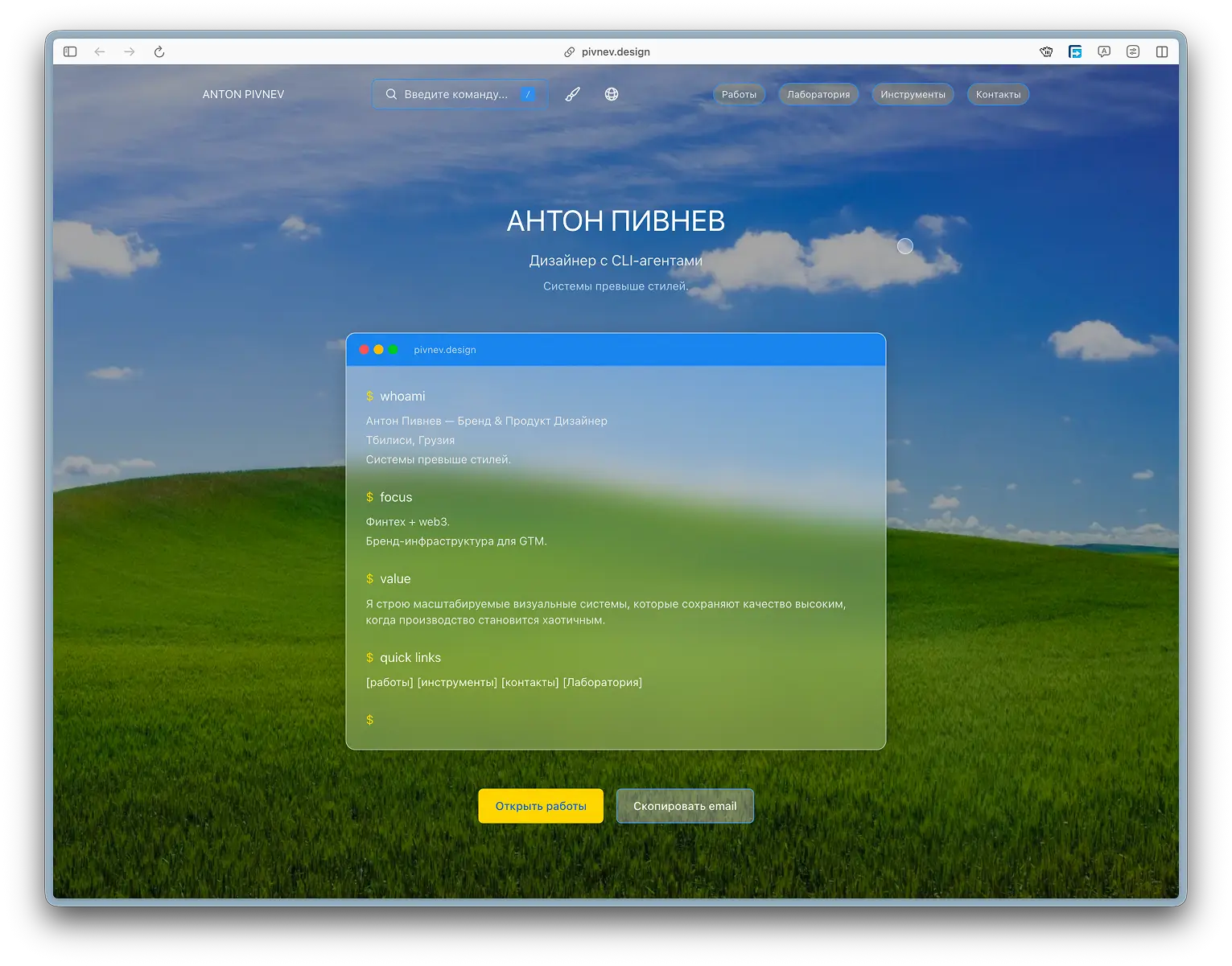
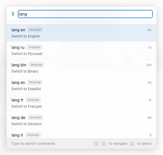
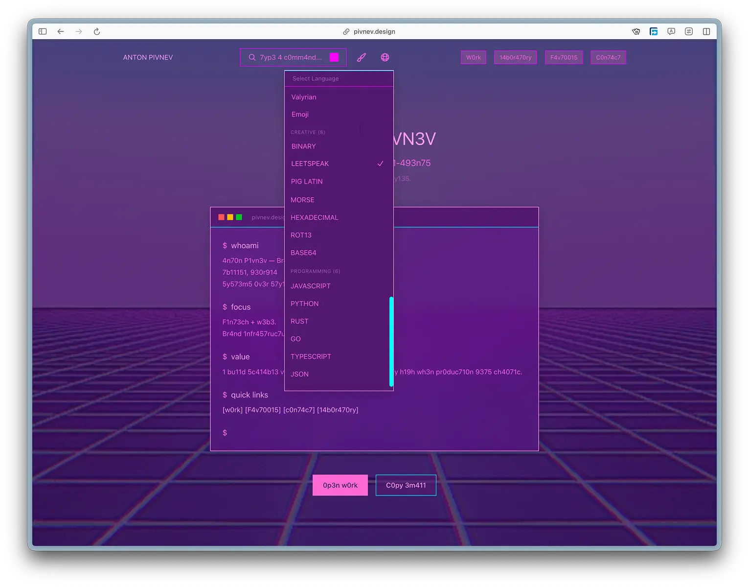
But if an experiment is only available in one language, then it is essentially still carried out “on the table”. Therefore, one of the first tasks was complete localization of the interface. More than 40 languages are currently available on the site, including experimental ones.
Some of them are human readable, some are added to demonstrate the approach. For example, the Emoji language, where all interface text is replaced with emoji - while all links and navigation logic continue to work correctly.
This looks like a joke, but in practice it shows that the translation system is built not on HTML substitution, but on keys and runtime transformations.
🎯 UX logic: effect versus efficiency
By default, the user arrives at the site in a light theme. This is intentional.
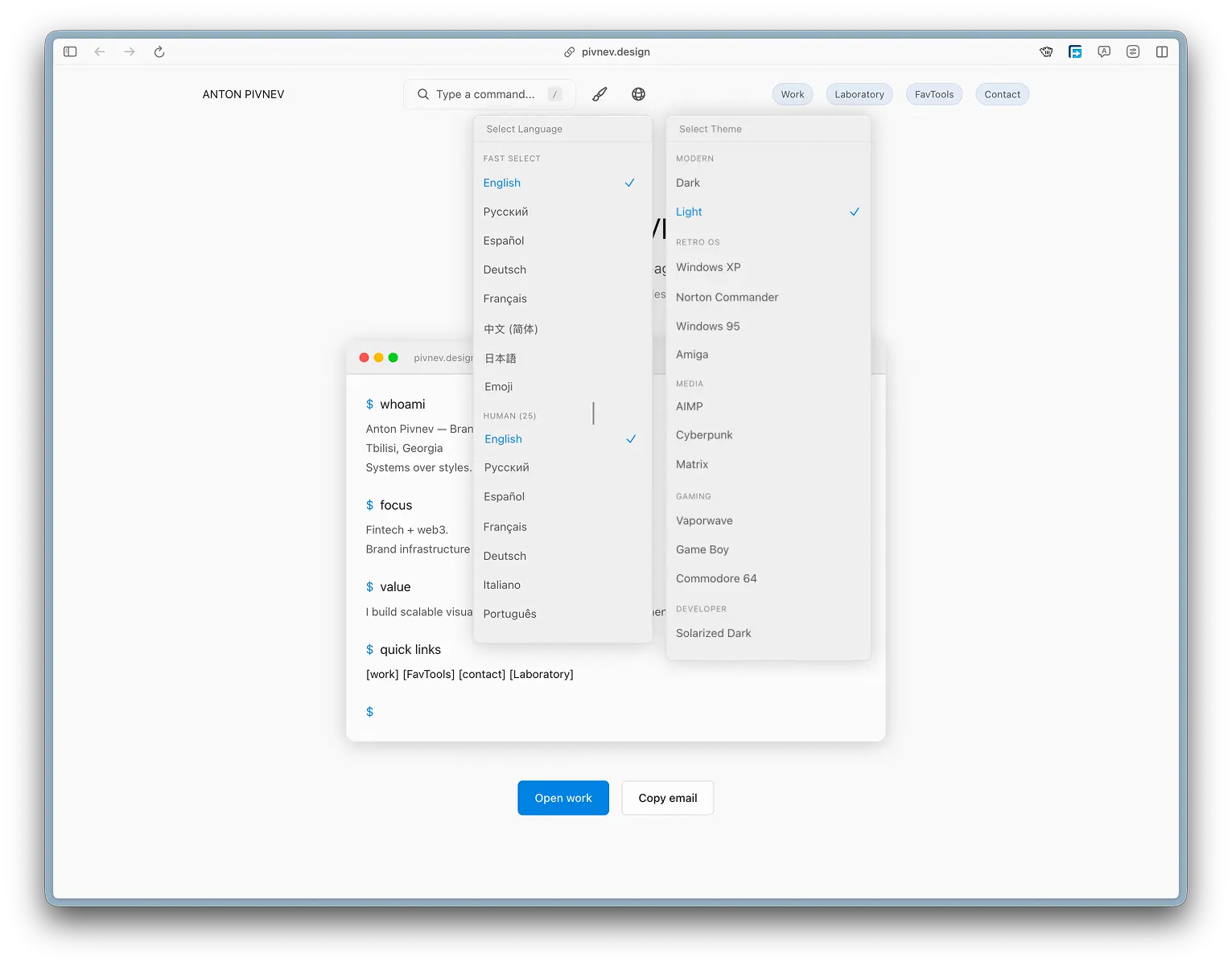
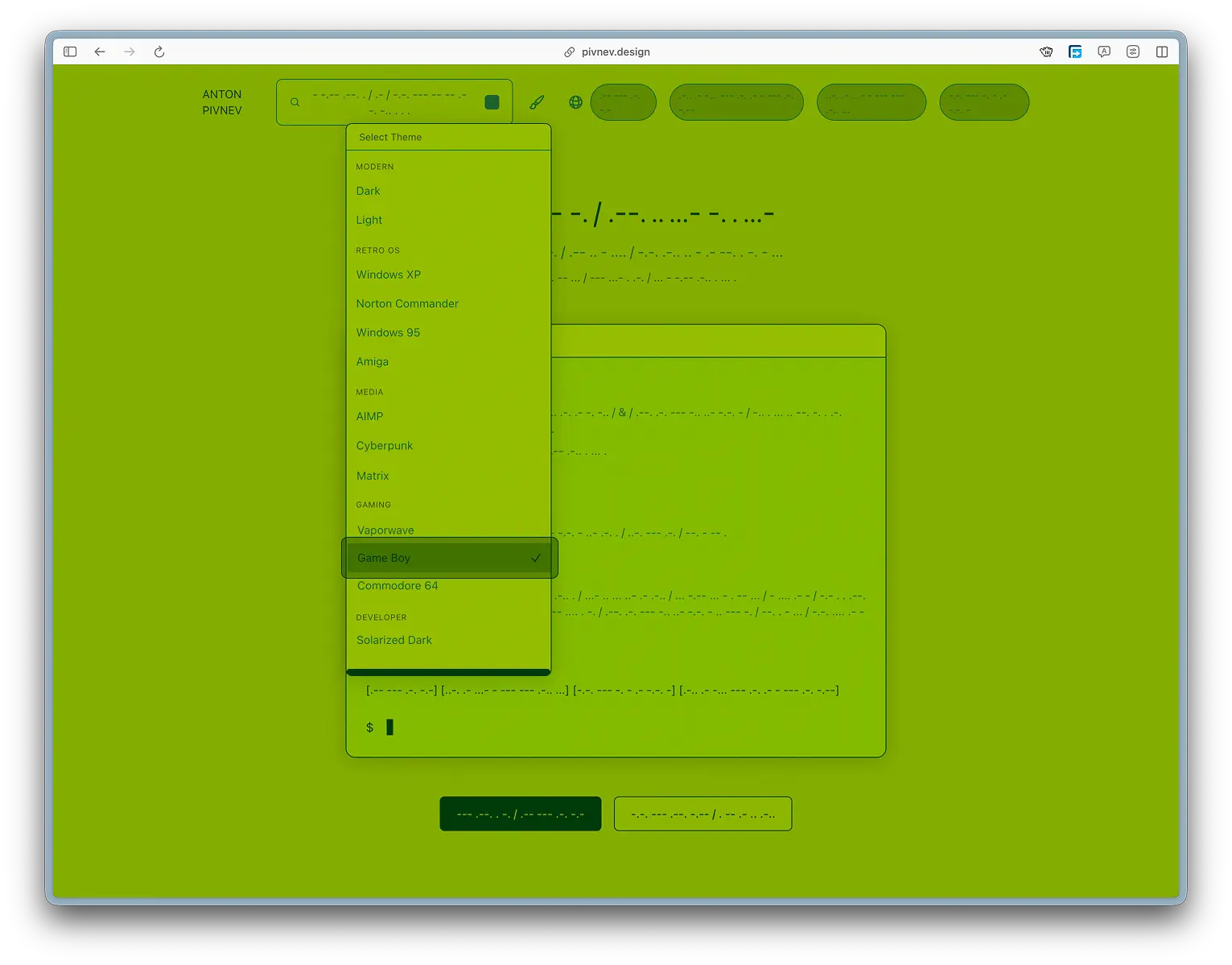
With a high probability, he will hover over the theme switch and will find not only the dark version, but also 11 more design options: from minimalistic to stylized for Windows 95 or classic audio players like AIMP.
The theme menu opens via hover so that the user accidentally “stumbles” on it while interacting with the interface and sees that the site supports not just light and dark themes, but a full-fledged visual adaptation system.
There is no automatic theme or language detection. This is a conscious decision: it is important that the user sees the very fact that there are so many options.
Moreover, after the first selection, the values are saved in localStorage - so repeat visits do not require additional configuration.
🌐 Multilingualism as a way to share experiments
Localization solves not only the problem of accessibility, but also reproducibility.
If some article or interactive case seems interesting, it can be implemented in another project - without the need to translate the documentation manually.
If there is no translation for a specific language, the system automatically uses the English fallback. This allows you to avoid rendering errors even with partially filled dictionaries.
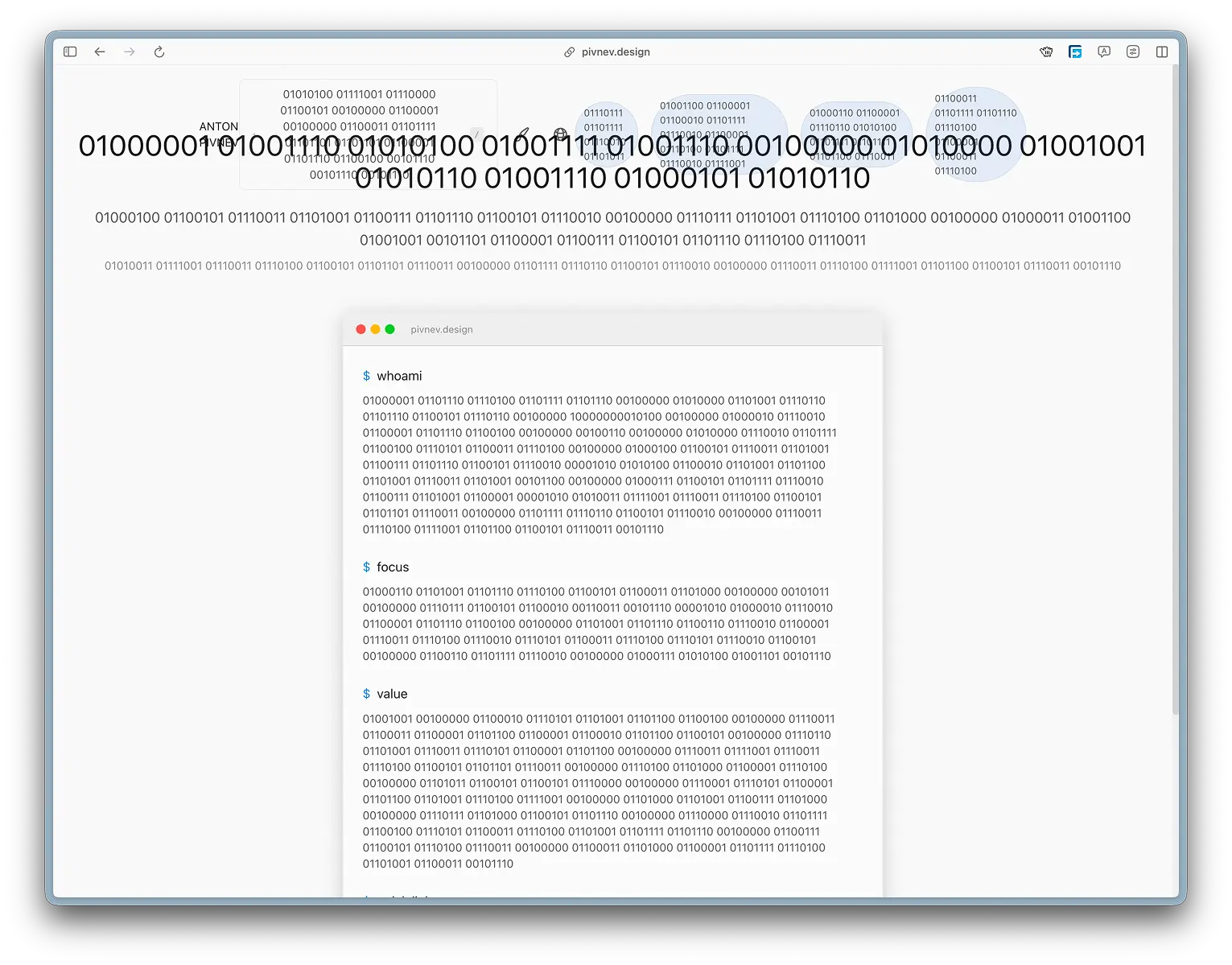
Some languages (for example, binary) can intentionally “break” the interface due to the length of the lines. This is a well-known compromise that I made in order to preserve the concept.
🤖 The role of AI in development
Most of the technical implementation - from the provider architecture to working with translations - was performed using the Qwen 3.5 Plus CLI agent.
At the same time, his task was not to make product decisions, but to automate routine work. Before starting development, I thought through pipelines in advance, selected technologies and formulated instructions with a minimum amount of uncertainty.
In those places where there were “blind spots”, the agent could offer alternative solutions - which were then checked manually.
This approach made it possible to use AI as an executive layer without delegating the creative part or interaction logic to it.
🎨 Theme system: 13 options and one clear principle
An important disclaimer right away: the themes here are not 13 individual interface designs, and certainly not 13 sets of components.
This is the same UI, but with different layers of styles: color palette, typography, background assets, glass layer and cursor parameters. I didn't specifically do "component themes" because:
- the development would turn into a series for several seasons;
- support would become a separate job;
- and yes, this would really load the system more (more logic and more branching).
Why 13
Because my favorite number is 513.
- 513 topics is already a diagnosis.
- 51 topics is still too much.
- 13 - enough for the user to be surprised, but not drown.
Why are themes selected manually?
I don't automatically determine the topic (by time of day, prefers-color-scheme, etc.). The reason is simple: if done “smartly”, the user won’t know that he has a choice at all.
And the moment of “guidance” is important to me:1) a person sees the site (light theme by default),
2) reaches for the switch,
3) and suddenly discovers a catalog of the atmosphere.
At this point, “effectiveness” does not contradict “effectiveness”: after the first choice, the topic is saved in localStorage, and then the site behaves like a normal adult product.
🧩 How themes are arranged technically
In short: theme = value data-theme by + set of CSS variables.
Where does the implementation live?
src/components/ThemeProvider.tsx- storing topic state, writing/reading fromlocalStoragesrc/styles/variables.css- the theme tokens themselves (CSS variables)
Basic idea
1) At the start, the theme is taken from localStorage (or light is used).
2) On place data-theme="...".
3) CSS variables are overridden by the [data-theme="..."] selector.
Plus: no need to create more classes and struggle with priorities.
Important detail: no flashes of the wrong topic
I don’t have a problem with “theme flashing” on the first load (when the default one is shown first, and then the saved one is picked up).
This means that the “user selected a topic → returned → saw the same topic” scenario does not turn into a disco for 100 milliseconds.
🖼️ Backgrounds and overlays
Some themes use background images or GIF animations. In order not to complicate the markup and not drag out individual components, the background is made using pseudo-elements body::before and body::after.
--theme-bg-image- the background itself--theme-bg-overlay- darkening/tinting layer
This provides a single mechanism for all topics where an “atmospheric environment” is needed, and a logical minimum price.
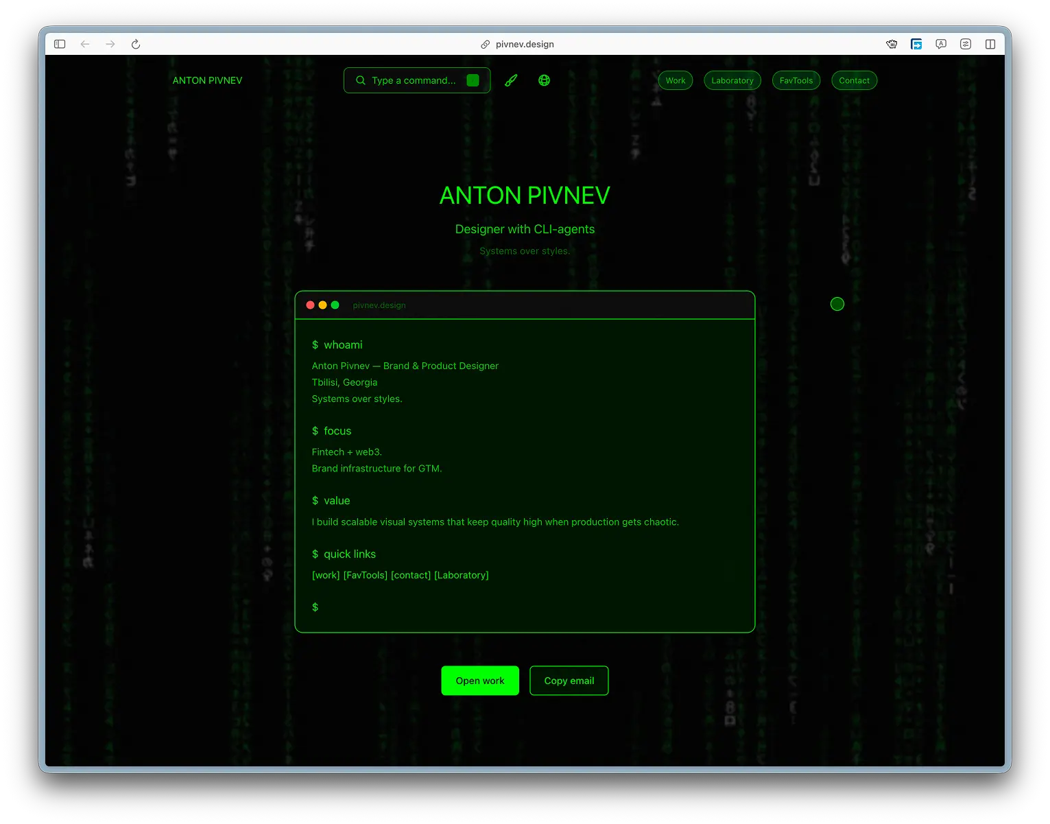
🧷 Cursor and retro themes
All themes use the same custom cursor in the iPadOS style - because I already went through the hell of implementing it once, and I don’t want to go there a second time.
But retro themes (Windows 95 / Commodore and similar) have one rule: no roundings.
Therefore, in such topics:
- border‑radius is forced to zero,
- the cursor becomes square.
This is not a “different cursor system”, it is the same cursor layer, but with temping parameters.
🧠 In a separate article I will analyze the cursor in detail: physics, hit‑targets, browser limitations and why Safari/Chrome is loved differently.
🌐 Multilingual: 40+ languages, including strange ones
With languages, the logic is similar: this is not a “translation for show,” but a way to break the language barrier and make experiments reproducible.
If I show an idea, I want it to be implemented not only by people who are comfortable reading Russian.
Why is the language also selected manually?
For the same reason as themes: it’s important to me that the user sees scale and variability.
Auto-language detection “quietly” solves the problem, but kills the demonstration of the system.
After the first selection, the value is stored in localStorage.
🧠 Translations, fallback and transformations
###Fallback
If there is no key in a specific language, the system shows English.
This is a conscious choice: the interface does not break and remains readable, even if a particular translation is incomplete.
"Sacrifices"
There are languages that can intentionally break the interface.
bin(binary) makes the lines long and sometimes breaks buttons and fields.- some human languages (for example Hindi) may be incomplete: somewhere there is less text than in the original.
I see this and accept it as a compromise: the purpose of these modes is not perfect typography, but to demonstrate the capabilities and nature of the project.
🧰 How it is implemented in code
Below are supporting fragments. They can be perceived as a “constructor”: if you need to repeat the system at home, you copy the principle, and not literally the entire repository.
Types and list of topics
ThemeProvider: saving to localStorage
CSS variables (simplified snippet)
🗣️ LanguageProvider and translation system
The mechanics are similar: state in Context, entry in localStorage, instant UI update.
- there is a set of keys (
TranslationKey), - there is a translation table,
- and there are transformation functions for “technical” languages.
Key principle: if there is no translation, show English.
✅ How I checked it (and why it didn’t work to “just run everything”)
Honest answer: fully checking 40+ languages on all pages manually is almost pointless.
I tried to give the check to the CI/agent, but with a large number of pages and languages it started:
- hallucinate,
- go into cycles
- and stopped producing useful results.
As a result, the check became hybrid:- I clicked through the pages with my hands and caught obvious mistakes;
- fixed problem areas;
- gave the agent specific tasks;
- he repeated until he either stopped seeing mistakes or began to doubt reality.
It's not "ideal," but it's fair and pragmatic: the system works, most languages are closed, and extreme regimes allow compromises for the sake of an idea.
🤖 Where is AI and where am I?
Qwen 3.5 Plus did most of the heavy lifting:
- architectural blanks,
- layout of individual blocks,
- part of the backend gizmos,
- and massive work with translations.
But product decisions are up to me:
- why does the user need manual selection,
- why hover and not click,
- where you can sacrifice perfection for the sake of effect,
- and where not.
AI here is not the “brain of the project”, but a fast performer who does not get tired, does not grumble and does not ask to “clarify the technical specifications a little more.”
Final: what does this system give?
1) The user receives personalization without registration and without unnecessary magic.
2) I get a platform for experiments, articles and saving successful cases.
3) Anyone can take the approach and repeat it at home - without a language barrier.
In short: it's not just “topics and languages.” It's the foundation on which it's comfortable to do weird and good things.